Armando Testa's visions, between Mondrian, MaleviÄ and Pollock
Gillo Dorfles had it right: if one were to consider Armando Testa (Turin, 1917 - 1992) only as a designer or as an advertising graphic designer, one would end up greatly reducing the scope of his art. “An artist endowed with vivid and robust painterly qualities,” a “prestigious creator of images, inventor of paradises” as well as, again using Gillo Dorfles’ definitions, a “global visualizer of the relations between man and the world, between production and consumption, between pure creativity and creativity aimed at a purpose,” Testa was able to wear both the shoes of the conceptual artist and those of the popular communicator, but also those of thedaring experimenter who fused together different mediums to arouse original and surprising effects, those of the ingenious creator of captivating metaphors and likeable characters that still populate the imagination of Italians (and not only of those who were enchanted in front of his advertisements while watching Carosello), and again those of the visionary capable of probing with curiosity, resourcefulness and vivacity the lesson of the great masters of the twentieth century (but not without looking to the past).
It is no coincidence that the latest exhibition dedicated to him, the one at the MART in Trento and Rovereto (from July 22, 2017 to October 15, 2017, curated by Gianfranco Maraniello and Gemma De Angelis Testa, Armando Testa’s wife), is titled All the “isms” of Armando Testa: the idea is to make people perceive how important, for him, was the exploration of the great artistic movements of the twentieth century(Futurism, Suprematism, Surrealism, Neoplasticism ... ), in the constant search for a cue, an idea, but also to recognize in advance the transformations of society. An attention that, as Gianfranco Maraniello writes in his catalog essay, “corresponds to a tension to understand one’s own time by drawing diffusely on forms of expression that traditionally inhabit the specific context of art as an absolute form, that is, freed from the need for a verification of effectivity in the dimension of the economy.” Testa, however, was moving within two poles: on the one hand, the urgency of communicating to a consumer audience that the commissioner needed to reach quickly and effectively (every advertiser should ask himself about the motivations he should offer his target audience so that they would stay to read or observe the message), and on the other hand, that of confronting the most up-to-date outcomes ofcontemporary art.
This continuous tension meant that even the seemingly easiest creations always concealed careful research that referred as much to art as to psychology: wanting to give an example, Maraniello locates the roots of the very famous Pippo hippopotamus (created for Lines) in Dadaism, because of the rejection of the rational dimension, the deconstruction of the “adult” component of information and the use of the typically infantile mechanism of onomatopoeic repetition, but also in the psychoanalysis of Freud and that of Lacan by virtue of the desire to act not on the deliberate awareness of the viewer, but on his unconscious. And equally well-known characters such as Carmencita and Caballero, the two “western” puppets of Lavazza’s Paulista Coffee, also have their origins in twentieth-centuryabstract art: on the occasion of an exhibition on Armando Testa held in Rivoli in 2001, the American artist Haim Steinbach, who recalled how, six years earlier, he had been invited to Gemma Testa’s home, called “geometric volumes made of plaster, ceramic, or plastic, inanimate but at the same time living forms” the Armando Testa characters, which Steinbach had seen displayed on a shelf in the room. Carmencita and Caballero are nothing more than two cones that find their characterization in a few elements added to the basic geometric solid, the pure form: both a nose, two balls to form the eyes and a graphic sign for the mouth, plus Carmencita’s braids, Caballero’s cowboy hat and gun. And all without colors: the completely white surface is one of the most distinctive marks of Testa’s two characters.
 |
| Armando Testa, Pippo (1966-67; polyurethane foam; Gemma De Angelis Testa Collection) |
 |
| Armando Testa, Carmencita and Caballero (1965; plaster; Gemma De Angelis Testa Collection) |
From Mondrian and, more generally, from the artists of De Stijl, Armando Testa borrows the need for an art that, as per the programmatic intent of the great Dutch artist and his epigones, is reduced toessentiality in order to make itself truly universal and to truly reach everyone through synthesis and balance. “Habitual vision,” Mondrian wrote, “does not perceive color, in nature, as plane, but perceives things (and color) as corporeity, as roundness. But in reality things take form from a complex of planes that are expressed plastically through angularity: form always appears more or less as a flowing angularity. So the technical development of the painter, even in academic teaching, consists above all in learning to see the flatness in the appearance of forms.” Hence the need for an art that does not admit of gimmicks and embraces a message of purity devoted to reducing subjectivity as much as possible and, conversely, seeking absolute truth. Although far from the often dramatic rigor that marked Mondrian’s action and career, Testa welcomed from him the aspiration to achieve the essential and the universal, with an admiration strong to the point of flowing into direct homage. Witness an untitled work, made between 1967 and 1985 and preserved in the collection of Gemma Testa: within an 1850 frame, which the artist considered an integral part of the work itself, lies a logotype constructed through Mondrian’s formulas, with the primary color backgrounds marked by horizontal and vertical black lines, although Testa indulges in the use of the oblique line that Mondrian had rejected (like the curved line, the diagonal line would, according to Mondrian, have broken the balance of the composition, and would have referred back to a passionate component alien to his way of seeing art).
Even in a work like the Chair with Pencil, a painted wood sculpture that becomes a pungent and shrewd allusion to the work of the graphic artist whose productivity is equally constrained by the chair and the pencil (with the latter holding the chair to the ground, as if forcing the artist to work and create) one recognizes the specifics of neoplasticism: how can one not think of Gerrit Rietveld’s Chair, animated by the same aesthetic reasons?
From the purity of Mondrian to that of Kasimir MaleviÄ, the step is short: the Russian artist has often been referred to as an additional point of reference for Armando Testa. Particularly significant, to grasp this particular ascendancy, is one of his most successful and persistent campaigns in the imagination, the one created in 1960 for Punt e Mes vermouth (a “point of sweet and a half of bitter,” reads the so-called payoff listing, with concise but icastical quickness, the product’s characteristics). The idea is so simple as to appear trivial: the essence of the Piedmontese aperitif is suggested only by two shapes, a sphere and a half sphere, which, in vertical tension, evoke the name of the spirit. For Gillo Dorfles, it is a “manifesto so famous that it is now a classic not only Italian, but international.” A “totemic declination,” to use Maraniello’s words again, of the Turin vermouth that is visibly reduced to its two main specifications through an abstraction that aims to reach, again, the essential, focusing on pure form and pure color. Supreme sensibility, Ã la MaleviÄ: indeed, the red sphere recalls the red circle of the great Russian artist’s most interesting pupil, Ilya Chashnik, a circle later used, in turn, for posters and covers. And then, noted a careful art historian like Arturo Carlo Quintavalle, who specializes in Renaissance art, Testa’s Punt e Mes is also a tribute to Luca Pacioli’s divina proportione: like almost all the great Italian artists of the 20th century, Armando Testa cannot renounce confrontation with tradition.
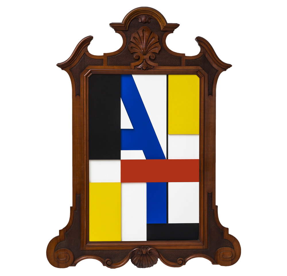 |
| Armando Testa, Untitled (1967-1985; colored formica, Leghorn frame c. 1850; Gemma De Angelis Testa Collection) |
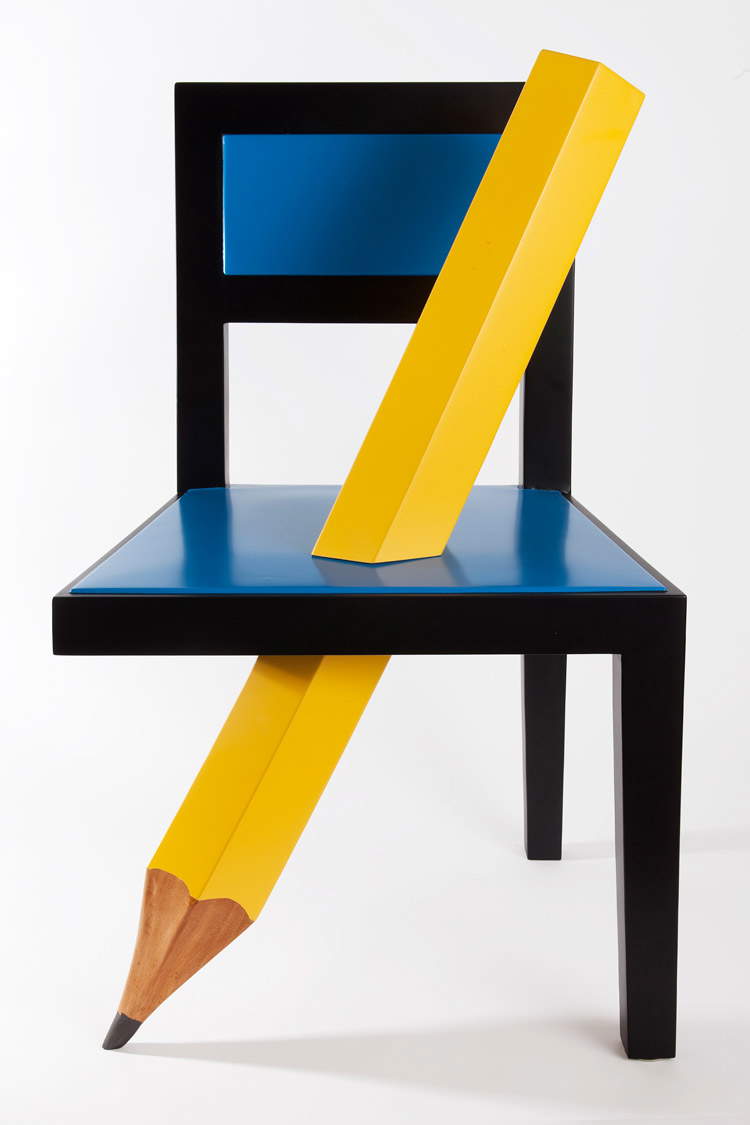 |
| Armando Testa, Chair with Pencil (1987; painted wood; Gemma De Angelis Testa Collection) |
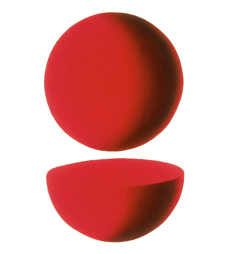 |
| Armando Testa, Punt e Mes (1960; acrylic on canvas; Gemma De Angelis Testa Collection ) |
Note howgeometric abstraction has always been a constant in Armando Testa’s art, right from his early days, when, in 1937, when he was just 20 years old, he won the competition for an advertising poster for a Milan color factory (ICI - Industria Colori Inchiostri), which was later never printed but is considered of remarkable importance for finding a “starting point” for one of the greatest advertising artists Italy has ever known: two triangles, one yellow and one red, were paired on a black field, leaving enough space between them to allow the insertion of a white parallelogram. The result was a kind of origami, a strange figure that did not refer to any form immediately referable to concrete reality but which, through synthesis, became the bearer of a load of meanings probably more eloquent than any other more detailed allegory. MaleviÄ’s most original research dated from about fifteen years earlier, and Mondrian had yet to leave for New York, the city where his art would experience brand new impulses: Testa, who had not lacked a good dose of audacity since the taste of the Fascist regime did not correspond to his own, immediately showed that he was receptive to these very high-level inputs. “Synthesis,” he would later declare, “has been a law of life for me in signs and words. Synthesis is wonderful, and when you use it, everyone is grateful. To be concise, essential in sign and form, that is my aspiration.”
Also amazing about Testa is his ability to try new paths, even opposite to those beaten up to a given moment in his artistic journey. Quintavalle wrote, again, “Testa has assimilated abstract expressionism, he certainly liked Cy Twombly, he liked Tobey, he liked Pollock most of all, and on this layer, which explains the vibrant intervention of the signs that traverse certain sections of the canvas, he has been able to insert a different discourse structure that consists of the construction of an image as profoundly corrupted from within, an image where the structure is crumbled, where you do not grasp a subject even if the title alludes to it.” Especially in the last phase of his career (when, almost in his eighties, Armando Testa tried to intensify his pictorial production: in fact, he feared that critics would overlook his paintings, which also represented for him a highly important mode of expression) he came to experiment with modes close to those of the abstract expressionists: Spaghetti on Canvas is an example of this, which, however, as is the case with almost all of Armando Testa’s works, never completely abandon the natural datum, which here subsists in the form of the object itself (spaghetti), whose meaning, however, is subverted. It is as if these spaghetti were an expression of that boundless vitality that animated the artist’s creations, but which in advertising graphics was always linked to a message to be clearly conveyed to the recipients and which therefore in painting could find its ultimate fulfillment.
 |
| Armando Testa, Spaghetti on Canvas (1991; color photograph; Gemma De Angelis Testa Collection) |
This relationship between painting and advertising is fundamental to an in-depth analysis of Armando Testa’s journey. The artist discerned a sort of continuity between his activity as an advertising graphic designer and his activity as a painter, but not only: painting (and his was as immediate as his advertising posters, but stronger) was for him a way to find himself, to give structure to a language, perhaps also a way to find that great freedom that is necessary for creative work but that in advertising remains subordinate to the needs of the client and those of the target. Gillo Dorfles again argued that if Armando Testa had devoted himself exclusively to painting, we would now be talking about one of the most fertile and talented artists on the border between naturalism and abstraction, who found a peculiar originality in making himself the interpreter of precisely that abstract expressionism that had so fascinated him. An image that gives a good idea of how vast were the flair, inventiveness, imagination, breadth of vision and receptivity of this great “global visualizer.”
Reference bibliography
- Gianfranco Maraniello, Gemma De Angelis Testa (ed.), Tutti gli “ismi” di Armando Testa, exhibition catalog (Rovereto, MART, July 22-October 15, 2017), Electa, 2017
- Ida Gianelli, Giorgio Verzotti, Gemma De Angelis Testa (ed.), Armando Testa, exhibition catalog (Rivoli, Castello di Rivoli, February 21 - May 13, 2001), Charta, 2001
- Gillo Dorfles, Critical Preferences. A visual look at contemporary art, Daedalus, 1993
- Germano Celant, Gillo Dorfles, Armando Testa. A retrospective, exhibition catalog (Florence, Palazzo Strozzi, May 9-July 11, 1993), Electa, 1993
- Omar Calabrese, Gillo Dorfles, Arturo Carlo Quintavalle, Armando Testa. Il segno e la pubblicità , exhibition catalog (Turin, Mole Antonelliana, July - October 1985), Mazzotta, 1985
Warning: the translation into English of the original Italian article was created using automatic tools. We undertake to review all articles, but we do not guarantee the total absence of inaccuracies in the translation due to the program. You can find the original by clicking on the ITA button. If you find any mistake,please contact us.


