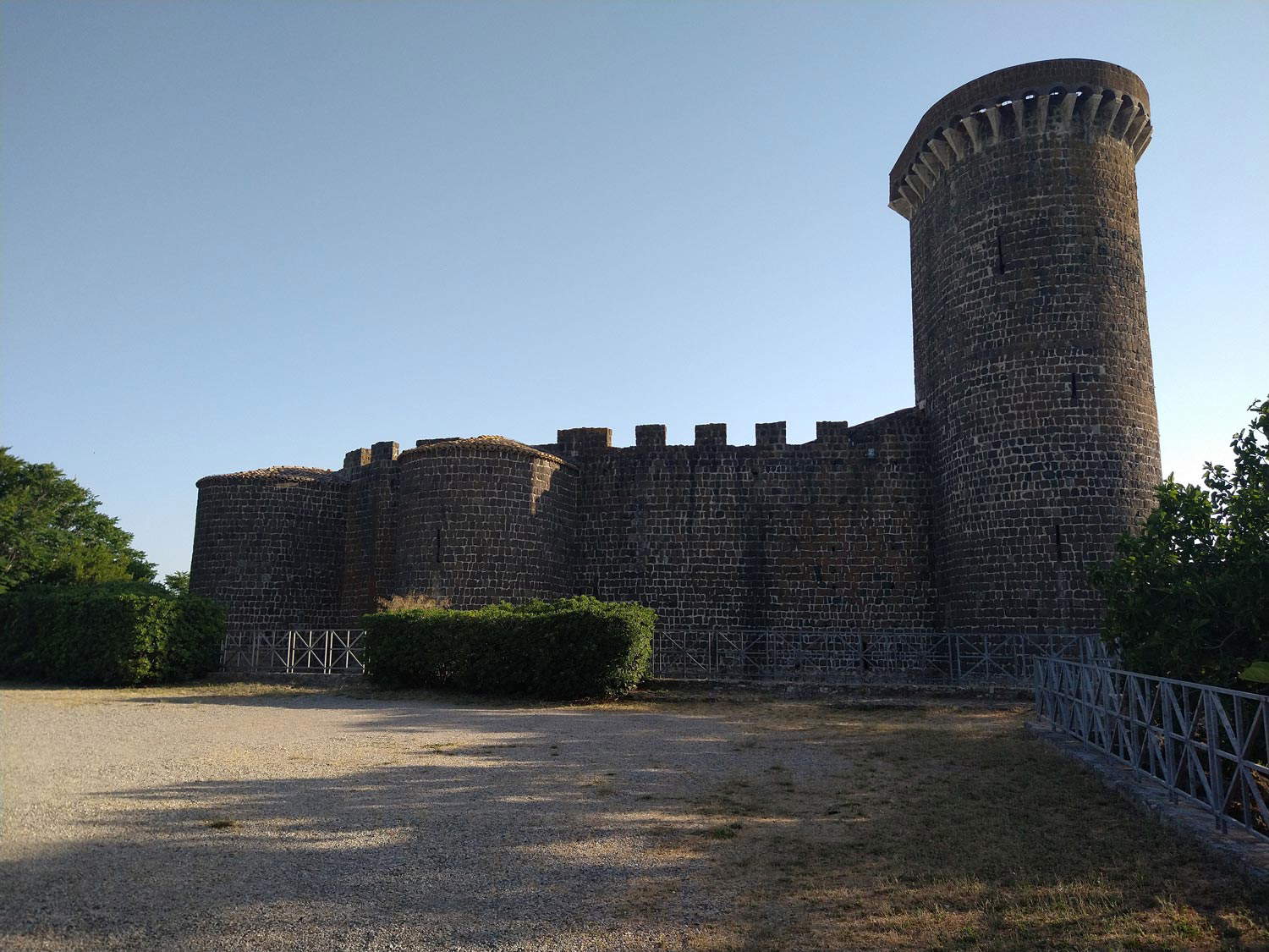
We are less than two years away from the 50th anniversary of the National Archaeological Museum of Vulci, an institute of rare merit that was opened to the public in 1975, with its headquarters in the imposing Castello della Badia, a severe fortress that stands beside the bridge over the Fiora River in a unique landscape: a hillock overlooking the gorge carved by the river in the middle of the Maremma countryside. The opening of the museum had redeemed the castle from a depressing state of neglect that had been dragging on for decades: then, in the mid-1960s, the state purchased the ancient fortress, subjected it to careful restoration, and on June 2, 1975, the museum was finally inaugurated to show everyone the richness and variety of materials from the ancient Etruscan-Roman city of Vulci and the necropolises that dotted its countryside. The upcoming birthday provides an opportunity to reflect on the museum’s layout, which was radically altered in June 2016.
Prior to this date, the public could still walk through the rooms with the original layout, curated by Francesco Correnti and Paola Moretti based on the scientific project of Mario Moretti, a valiant protagonist of mid-twentieth-century Etruscology (to whom we owe much of our knowledge about Vulci and Tarquinia): in the exhibition, set up according to a strictly chronological criterion, the public could observe the archaeological material arranged in elegant showcases, respectful of the medieval architecture, excellently integrated in the context of their ancient container, able to follow the course of the rooms of the castle with clarity and harmony, according to a project that, wrote Anna Maria Sgubini Moretti in 1993, was “marked by a balanced simplicity that, by connecting with the severe character of the monumental structure and guaranteeing its suitable enjoyability,” managed “at the same time to enhance the precious uniqueness of the archaeological contexts that appear on display.” The Correnti and Moretti rooms, as mentioned, were completely transformed, not to say overturned, seven years ago, with the new layout by Luciana Di Salvio and Simonetta Massini, based on the scientific project of Simona Carosi and Patrizia Petitti, founded on totally different principles, oriented mainly, if not solely, to didactics.
 National Archaeological Museum of Vulci (
 National Archaeological Museum of Vulci (staging
 National Archaeological Museum of Vulci (staging
 National Archaeological Museum of Vulci (staging
 National Archaeological Museum of Vulci (staging
 National Archaeological Museum of Vulci (staging
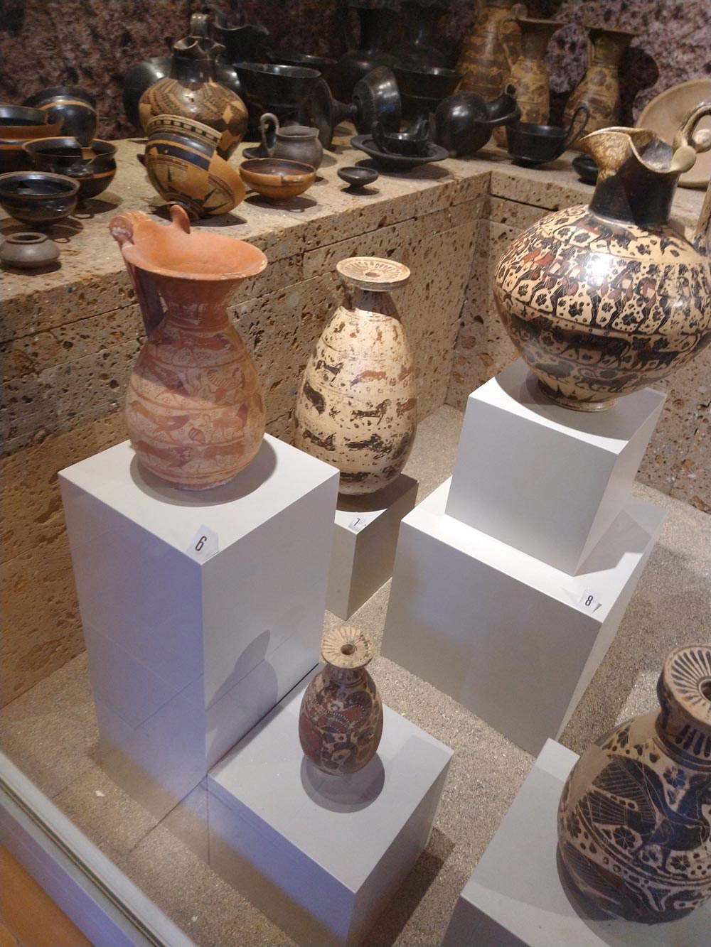 National Archaeological Museum of Vulci (staging
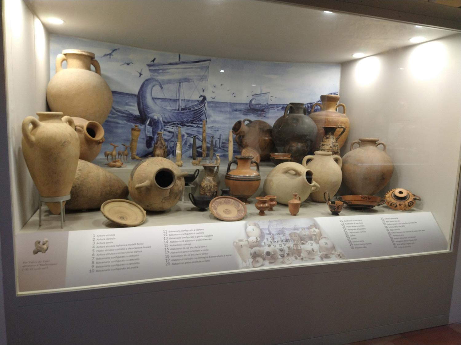 National Archaeological Museum of Vulci (staging
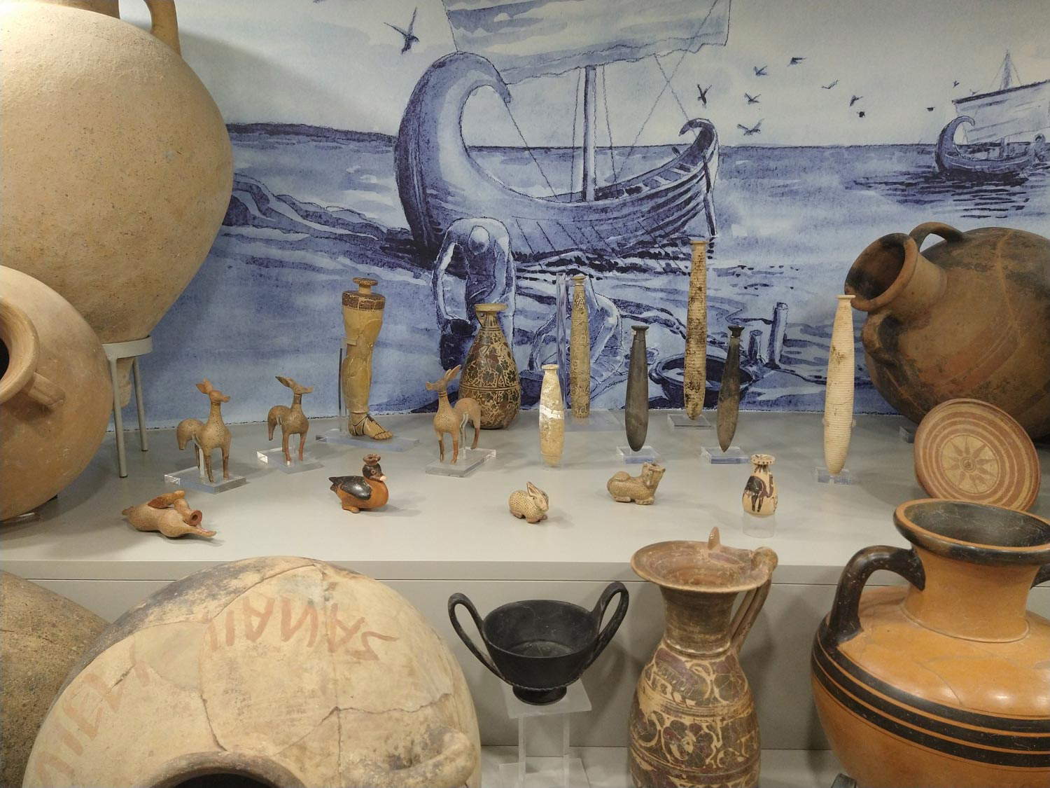 National Archaeological Museum of Vulci (staging
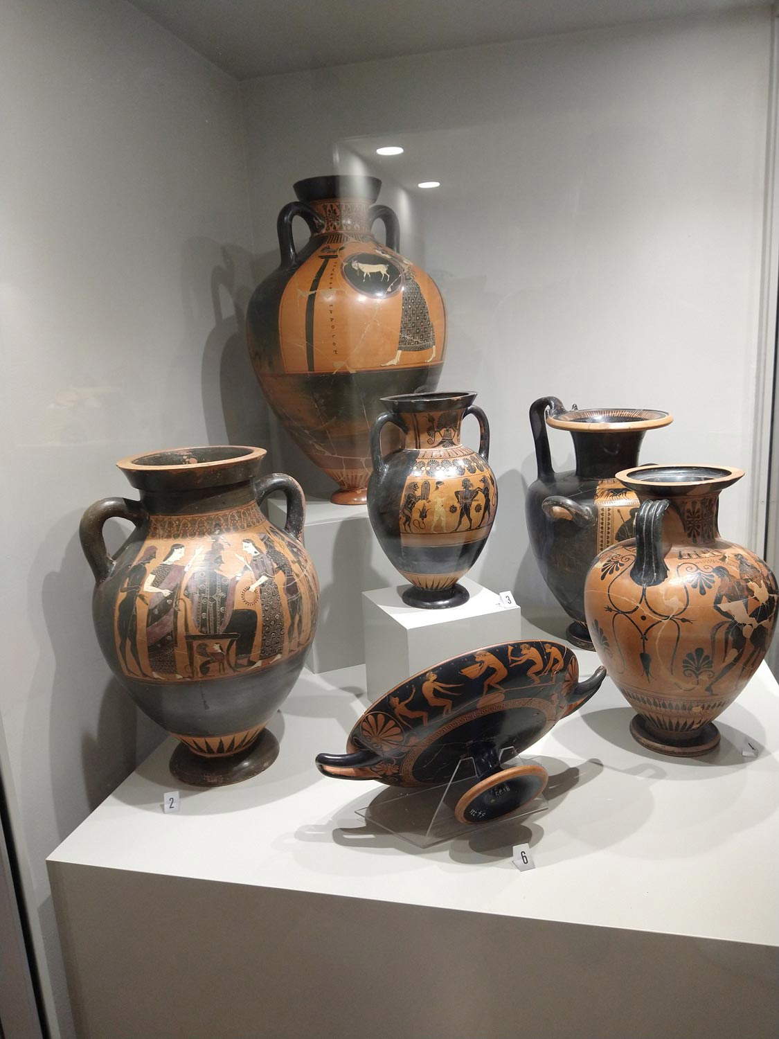 National Archaeological Museum of Vulci (staging
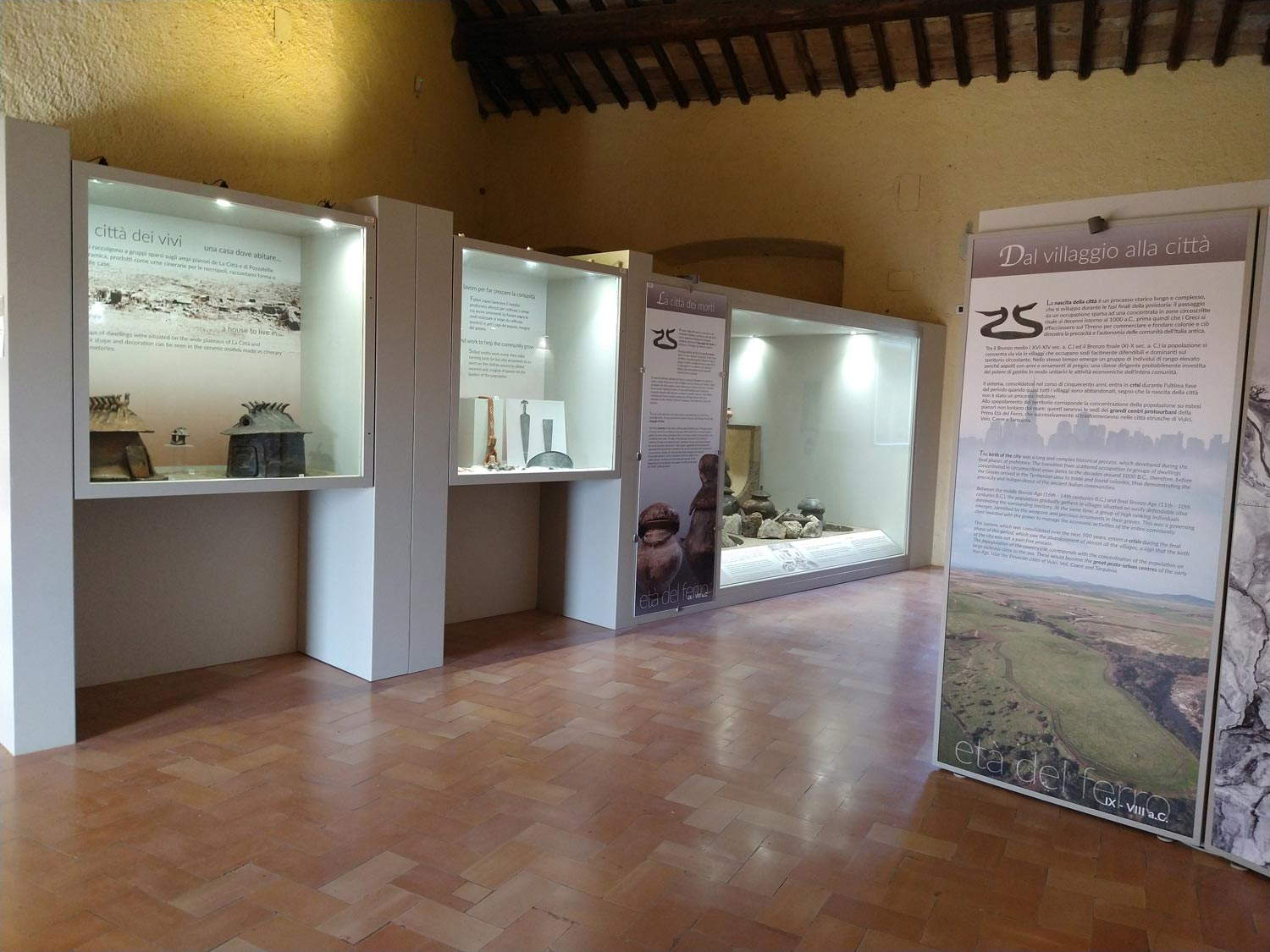
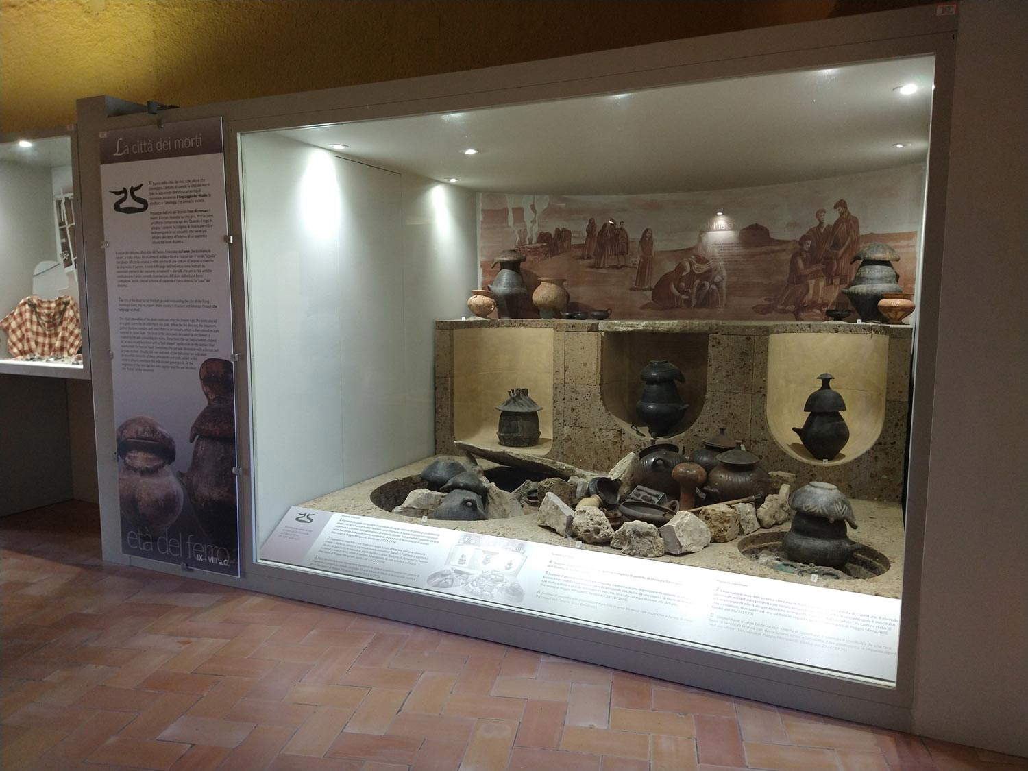
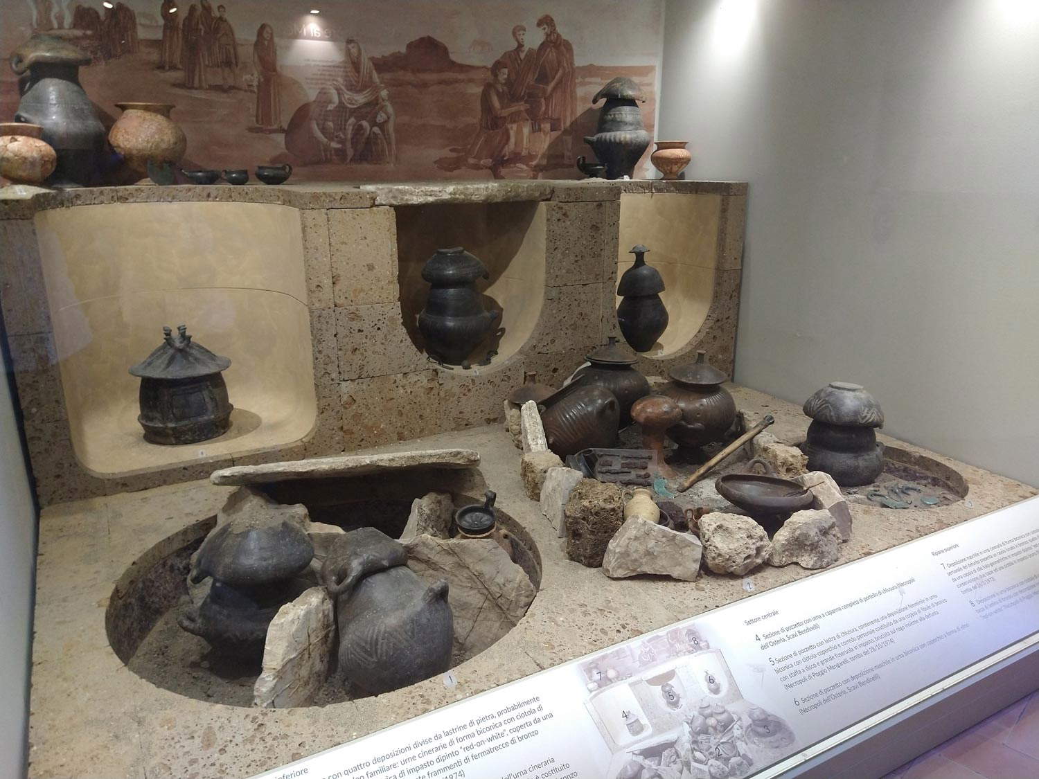
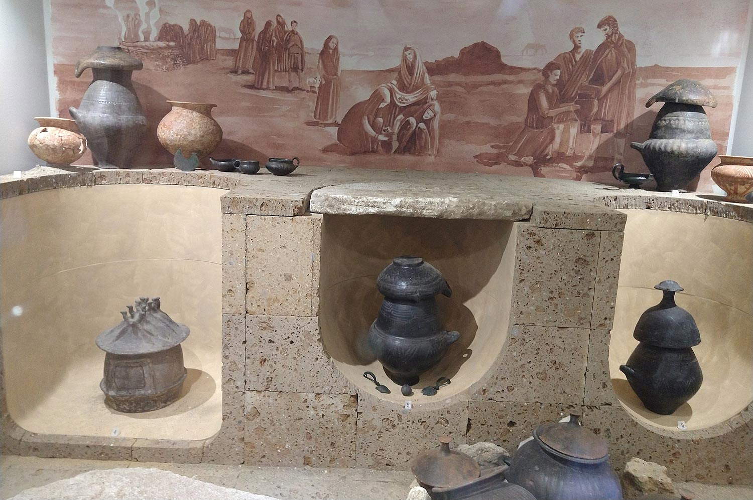
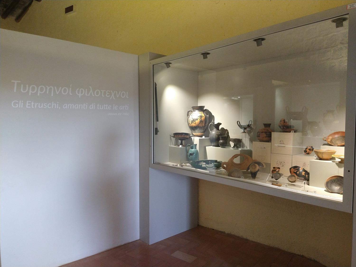
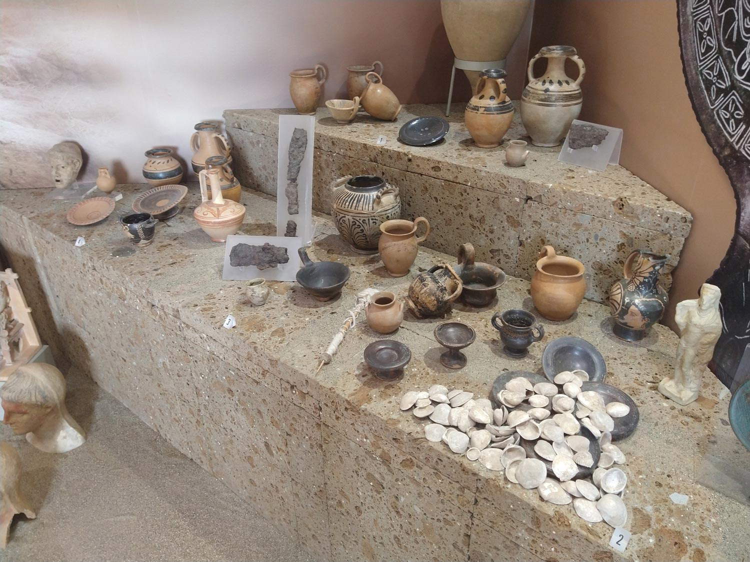
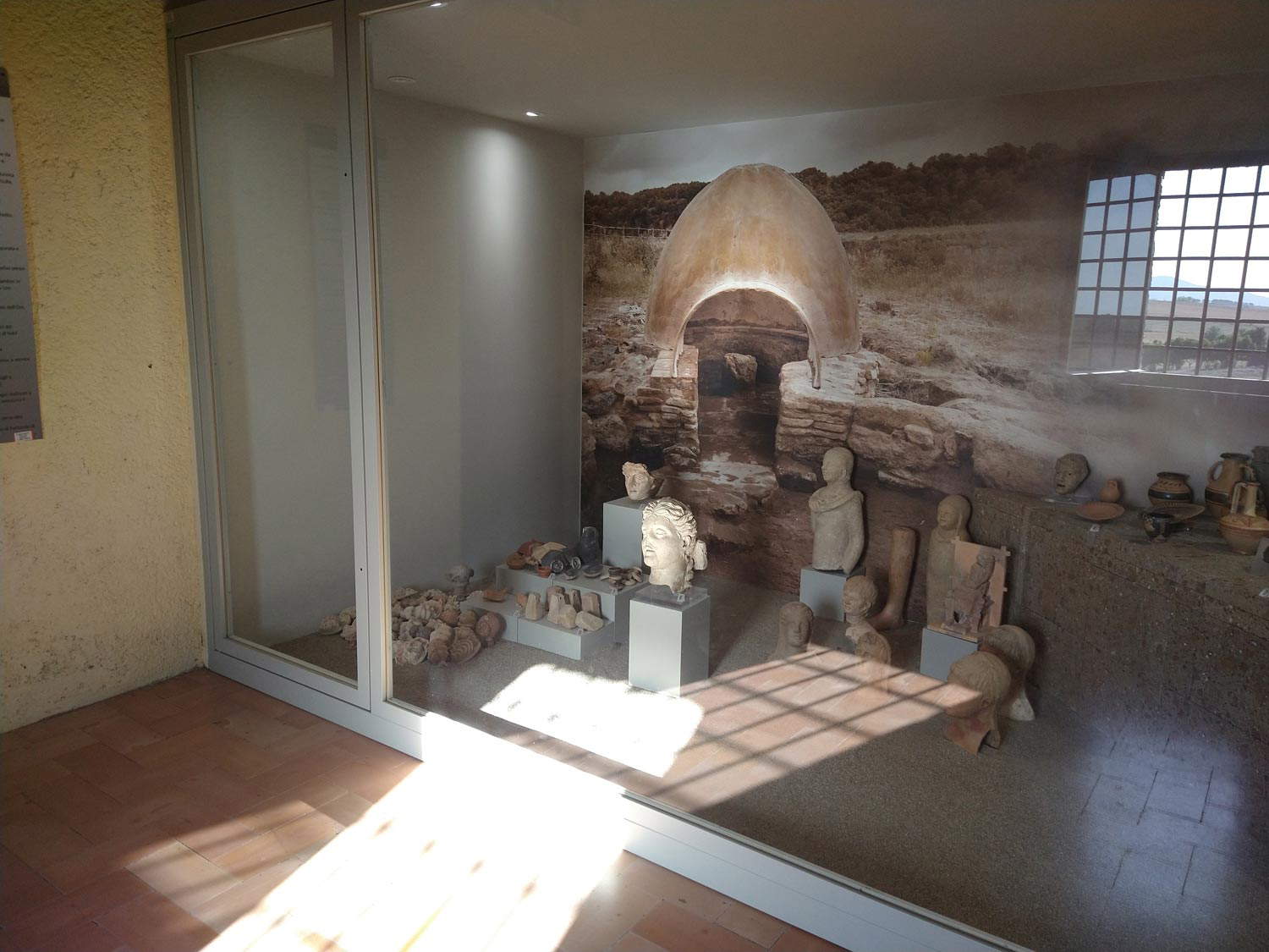
Those who enter the National Archaeological Museum of Vulci today will no longer see the original showcases, which, moreover, also constituted an interesting historical documentation of the museography of the time, reminiscent of those that Franco Minissi had designed a few years earlier for the National Etruscan Museum of Villa Giulia. And it will no longer go along a visiting itinerary set according to chronological terms (a choice that, moreover, does not exclude thematic lunges: much more complex, instead, to imagine a route that does the opposite). On the contrary, the new layout leads the visitor through a thematic itinerary, with the exhibits displayed inside “sceneries” perhaps inspired by the dioramas of natural science museums, and which in the intentions of the project should be “evocative” and suitable to enhance the material “through reconstructive images.” However, in practice, Carosi and Petitti’s intentions have resulted in showcases that are decidedly heavier than those of the 1970s, decorated with watercolor-illustrated backdrops, with children’s book-like images that would be perfectly fine in a museum itinerary aimed at a young audience (because perhaps represents the overwhelming majority of visitors to that museum, and the choice to speak predominantly to teenagers, though debatable, would therefore be legitimate, as long as you state it for such), but which appear off target if the intent, as Carosi stated in one of his 2019 articles, is to show an itinerary that is "easy to understand for different target visitors, especially the uninitiated." One struggles to understand why, nowadays, cultural heritage communication, in addressing a wide audience, often has to adopt patterns and languages that seem designed for adolescent audiences: just look at the vast plethora of creators who spread art and archaeology content on social media and who seem to speak to an audience of 12-year-olds. What then are the "different targets“? Who are the ”outsiders“? What age are they, where are they from, what experiences do they have, what is their cultural background? Not to mention that such an arrangement, which uses the tool of ”scenery“ for almost the entire route, limits and constrains the space for aesthetic experience, and paradoxically, in its intention to rework the form and content of the route ”to be inclusive," instead ends up denying the concept of the museum as a space of multiplicity, which innervates the most up-to-date museography.
It is true that at the very moment one decides to present an object to an audience, it is impossible to avoid arbitrary intervention. Even the most neutral setting one can imagine is still the result of an idea that intervenes on a decontextualized object such as a piece displayed in a museum. There are, however, layouts that can steer a museum’s holdings in a precise and clear direction, and this seems to be the case with the Vulci museum, which predominantly if not exclusively privileges the educational aspect by shaping an “exhibition not of materials, but of historical narratives”, as Carosi writes, who explicitly states that in the 2016 layout the exhibits “became a means (and not the object) of museum communication, with the basic idea that the visitor could literally ’immerse’ himself in the history of the Etruscan city and its inhabitants.” Now, such an approach would be entirely correct for a room or a group of rooms (if the museum is large enough), or for a temporary exhibition, but it becomes exclusionary and in some ways even prevaricating if it is extended to the entire museum, all the more so if it intervenes on a display that was yes recent since it was only forty years old, but it was born with the museum itself (it was therefore not only “the old layout,” as Carosi superficially defined it, but it was the form that had been given to the National Archaeological Museum of Vulci when it was born and, above all, it was a form that was well suited to the institution). Not to stray too far from Vulci, it is difficult to imagine, for example, a National Museum of Tarquinia where every room is adorned with illustrated backdrops: instead, one will find rooms with more open displays, one room, that of the Winged Horses, suggesting a lost context, and still other rooms, those of the painted tombs, reconstruct environments. The presentation of each exhibit, in other words, should be well weighed. For the very moment the curator chooses to place at the center of the entire experience not the objects, but a series of “historical narratives,” it goes without saying that he ends up depowering the material by providing the audience with a pre-packaged idea, the finds are prevented from opening up further possibilities, the doors to other interests, other readings, are closed. An archaeological find has so much to say, it is not just about historical narratives: if we take the case of, say, a historiated pottery, we can talk not only about its historical context, but about the story its figures tell, how it was made, how it was found, its place along the history of the development of an artistic technique, and so on.
 National Archaeological Museum of Vulci (
 National Archaeological Museum of Vulci (staging
 National Archaeological Museum of Vulci (staging
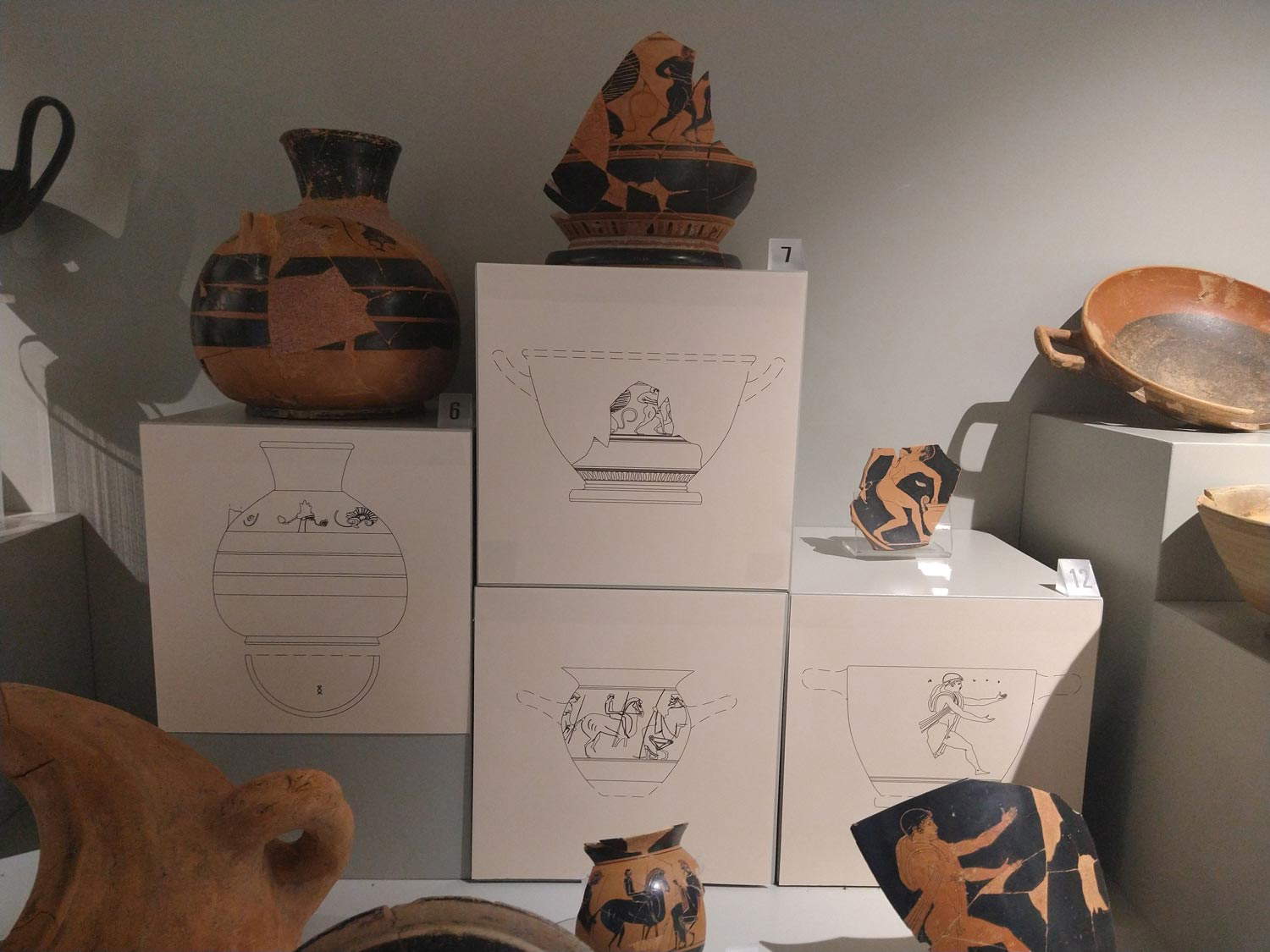 National Archaeological Museum of Vulci (staging
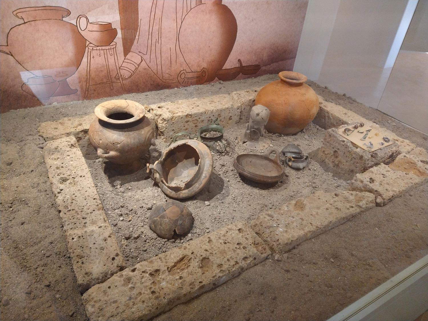 National Archaeological Museum of Vulci (staging
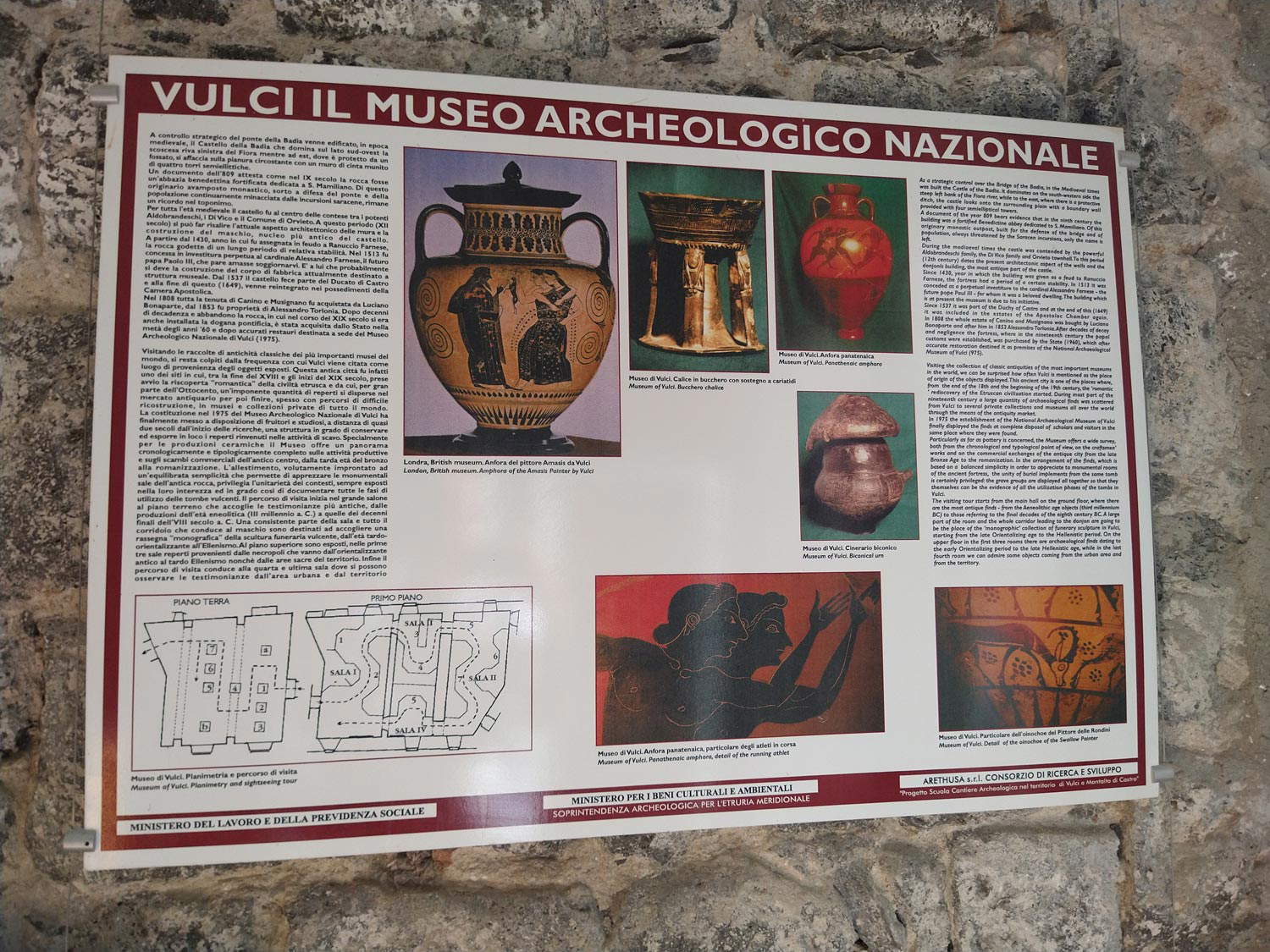
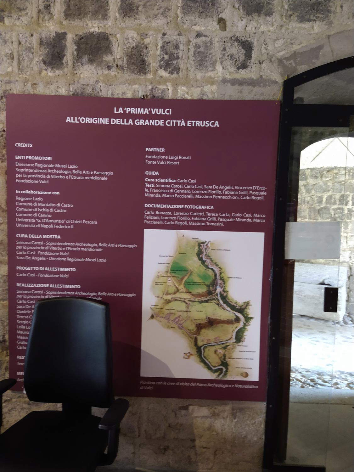
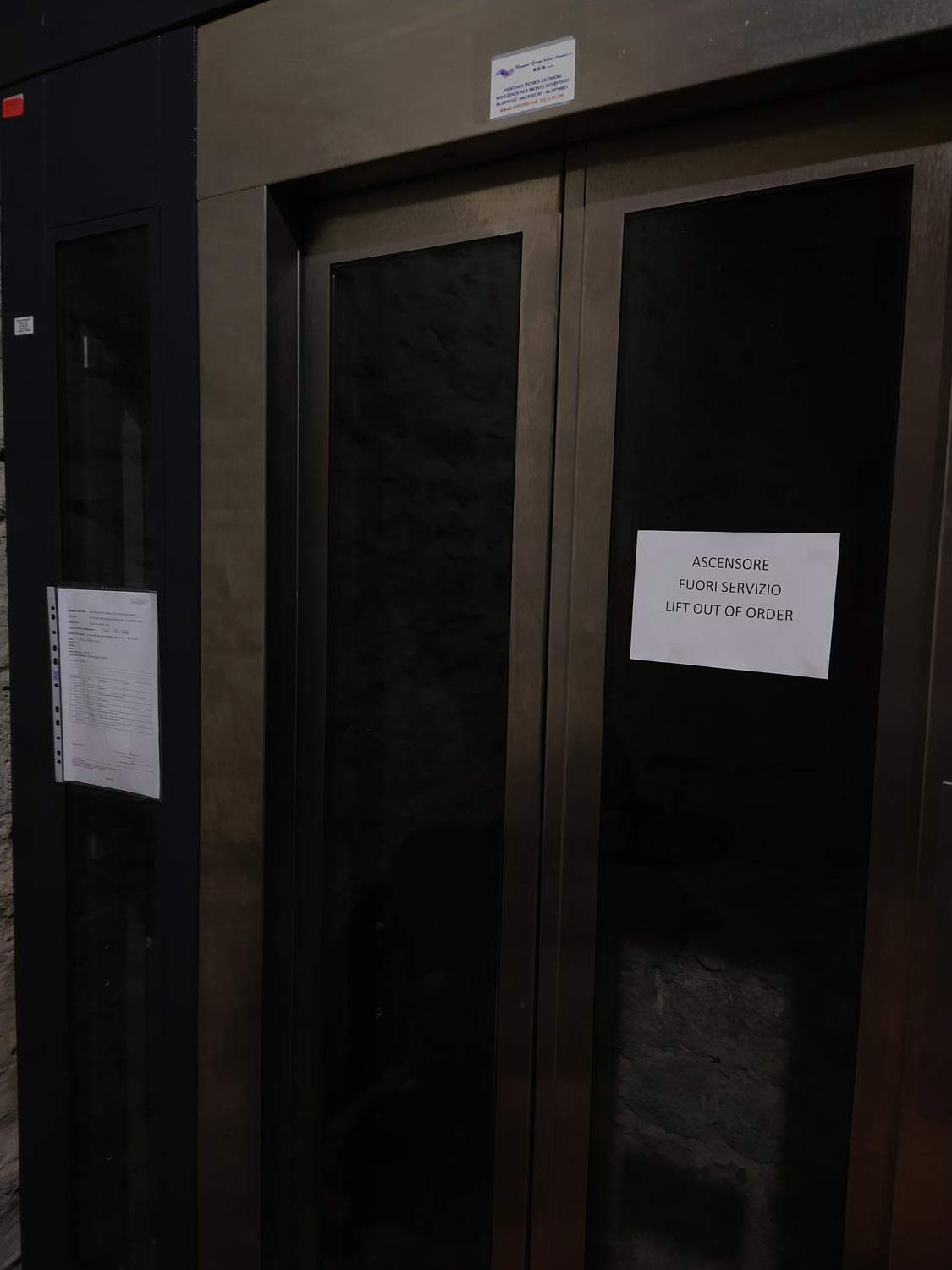
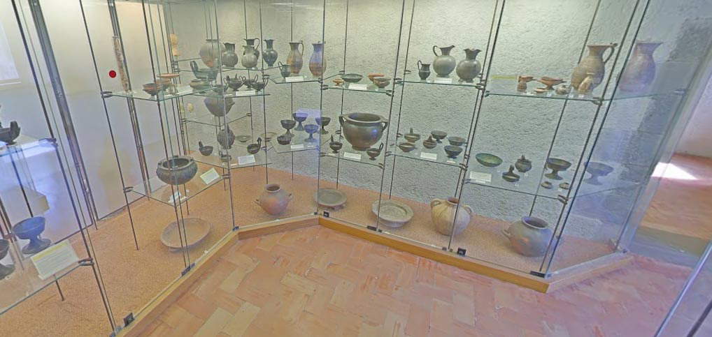
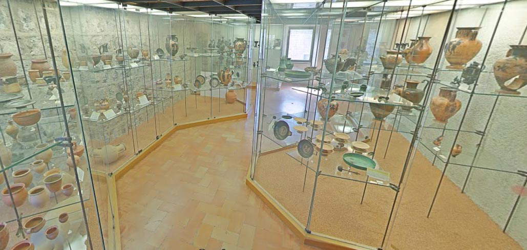
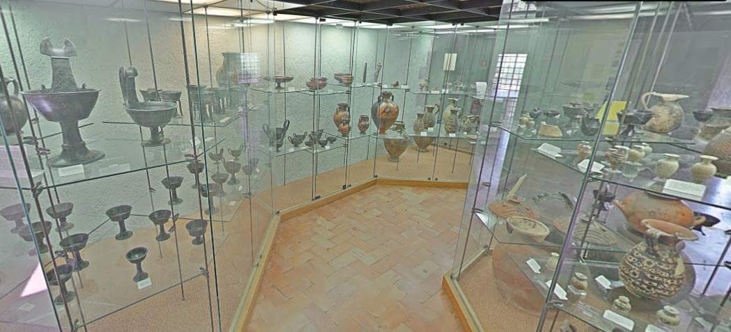
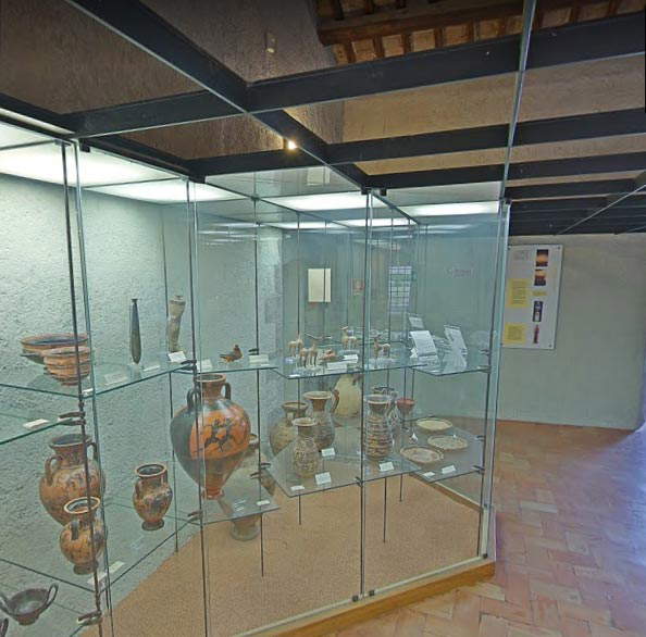
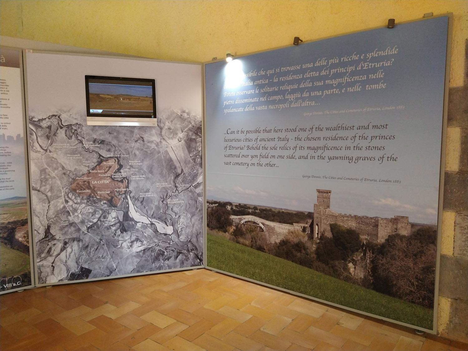
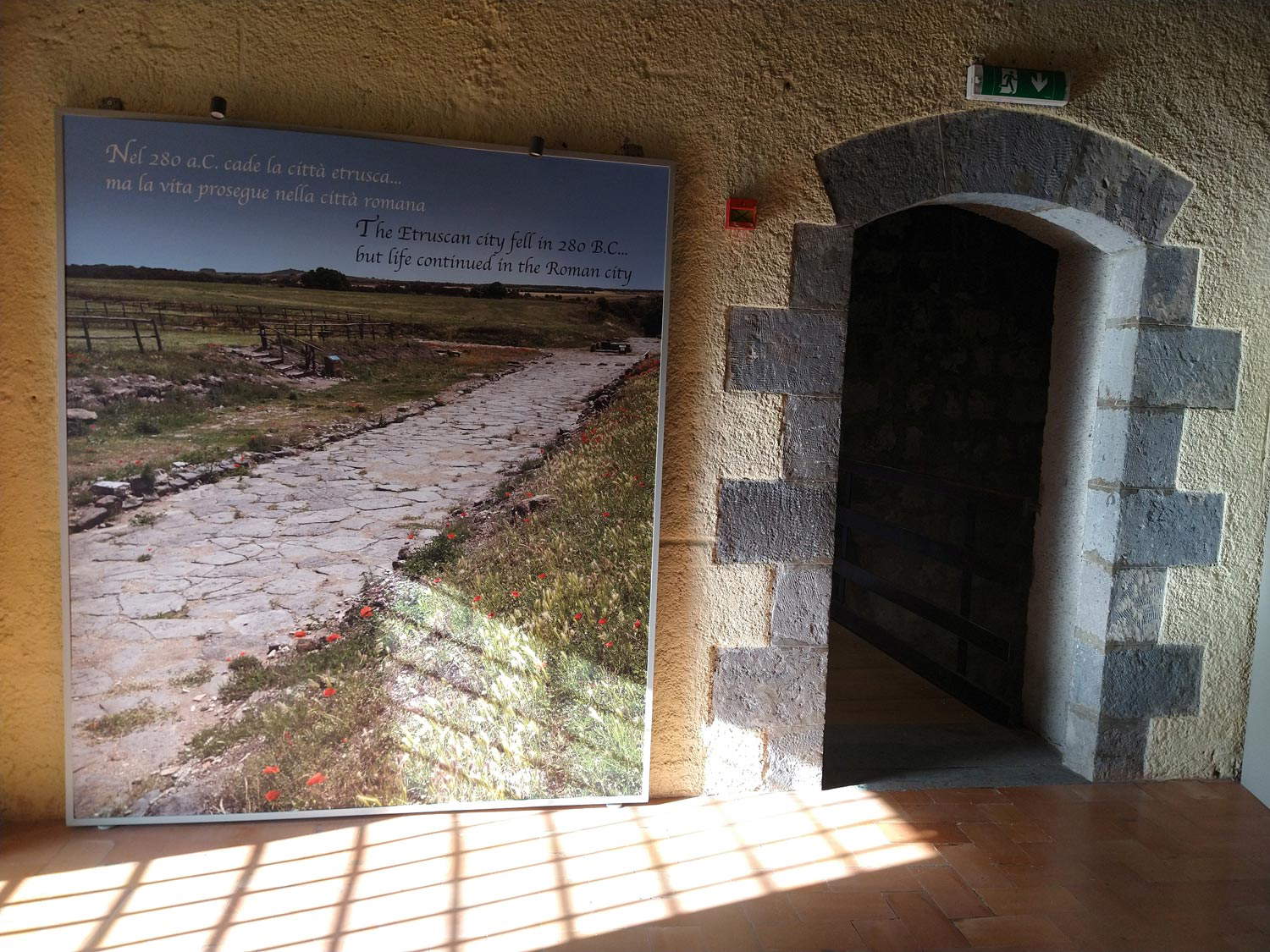
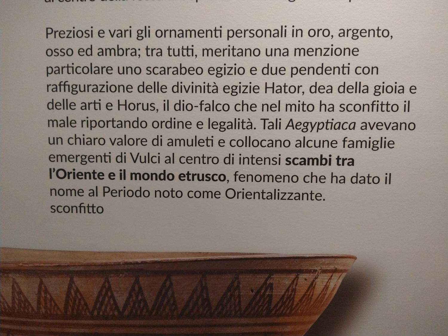
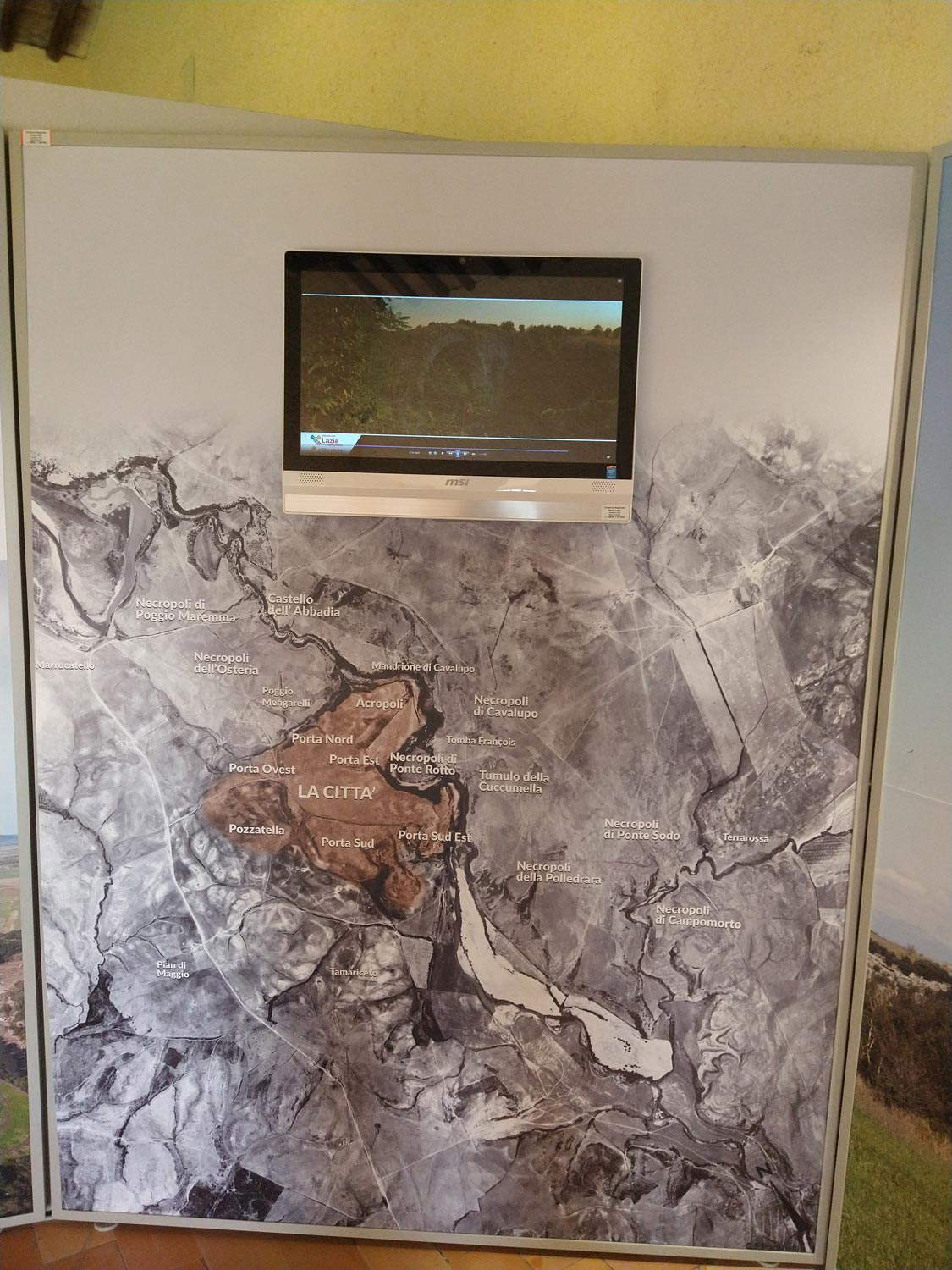
There are then, in the new layout of the Vulci Museum, several other questionable elements, which convey an impression of pervasive sloppiness (amplified, moreover, by situations that are hopefully as temporary as possible, such as the out-of-service elevator, or the ground-floor exhibition introductory panel set up behind the ticket counter): the presence of huge, inappropriate photographs that often show the visitor what he can simply see with his own eyes outside the museum (the landscape around Vulci, the Castello della Badia itself inside which the visitor is standing), the panels with awkward fonts and overlapping lettering, the English texts that are sometimes italicized and sometimes not, those in Italian with boldface placed here and there for no apparent reason and sometimes even with typos, the labels with inventory numbers attached to the panels, the beverage dispenser area in the courtyard neglected and where there are even old-fashioned panels with the museum described, of course, according to the previous route. And then, speaking of inclusiveness, the usual triumph of kylix, hydria, kantharos, lekythos, alabastron with no explanation for the public entering for the first time a museum where ancient ceramics are exhibited (but in this case, however, it should be pointed out that the problem is common to almost all archaeological museums). Last but not least, the new layout has conspicuously reduced the exhibits.
Was the original display untouchable? Of course not, like any exhibit. But it was possible to intervene in a less radical way, making updates where necessary, without altering the itinerary imagined when the museum was born (as was done, for example, four years ago at the Museum of the Etruscan Academy in Cortona, where no one dreamed of touching the historical display cases in the Sala del Biscione, and where the given priority to the history of the institute, but without limiting other perspectives) and leaving the visitor free to choose which narrative to follow (with the 2016 installation, it should be specified, an interesting free audioguide was also launched that anyone going to the museum can download). There is still a way, fortunately, to see the 1975 layout: just open Google Street View, where, thanks to a protocol signed more than a decade ago between the then Ministry of Cultural Heritage and the American company, several Italian museums have been mapped and can be explored simply by standing in front of your screen, on your computer or cell phone. Among the museums is Vulci: a virtual tour will be enough to notice the difference. Therefore, let the layout of this small but valuable museum be revised. Let objects be brought back to the center of the discourse. Let the progressive and constant tendency to infantilize the public be resisted. The Vulci National Archaeological Museum experienced a sharp decline in visitors even before the pandemic: rethinking how the institution presents itself to the public might be one way to reverse the trend.
The author of this article: Federico Giannini
Nato a Massa nel 1986, si è laureato nel 2010 in Informatica Umanistica all’Università di Pisa. Nel 2009 ha iniziato a lavorare nel settore della comunicazione su web, con particolare riferimento alla comunicazione per i beni culturali. Nel 2017 ha fondato con Ilaria Baratta la rivista Finestre sull’Arte. Dalla fondazione è direttore responsabile della rivista. Nel 2025 ha scritto il libro Vero, Falso, Fake. Credenze, errori e falsità nel mondo dell'arte (Giunti editore). Collabora e ha collaborato con diverse riviste, tra cui Art e Dossier e Left, e per la televisione è stato autore del documentario Le mani dell’arte (Rai 5) ed è stato tra i presentatori del programma Dorian – L’arte non invecchia (Rai 5). Al suo attivo anche docenze in materia di giornalismo culturale all'Università di Genova e all'Ordine dei Giornalisti, inoltre partecipa regolarmente come relatore e moderatore su temi di arte e cultura a numerosi convegni (tra gli altri: Lu.Bec. Lucca Beni Culturali, Ro.Me Exhibition, Con-Vivere Festival, TTG Travel Experience).
Warning: the translation into English of the original Italian article was created using automatic tools. We undertake to review all articles, but we do not guarantee the total absence of inaccuracies in the translation due to the program. You can find the original by clicking on the ITA button. If you find any mistake,please contact us.