GNAM adds a C and becomes G/N/A/M/C to unite historical memory and contemporaneity
A C for Contemporary is added to GNAM in Rome: the museum has chosen to undertake a rebranding project to renew its image and strengthen its connection with the public, and so it has become G/N/A/M/C. The decision stemmed from the observation that the name “The National Gallery” has not rooted a strong identity in the collective imagination, with citizens, scholars and the media continuing to refer to the museum by the acronym GNAM. Moreover, the name “The National Gallery” generated confusion with other national galleries within the landscape of state museums.
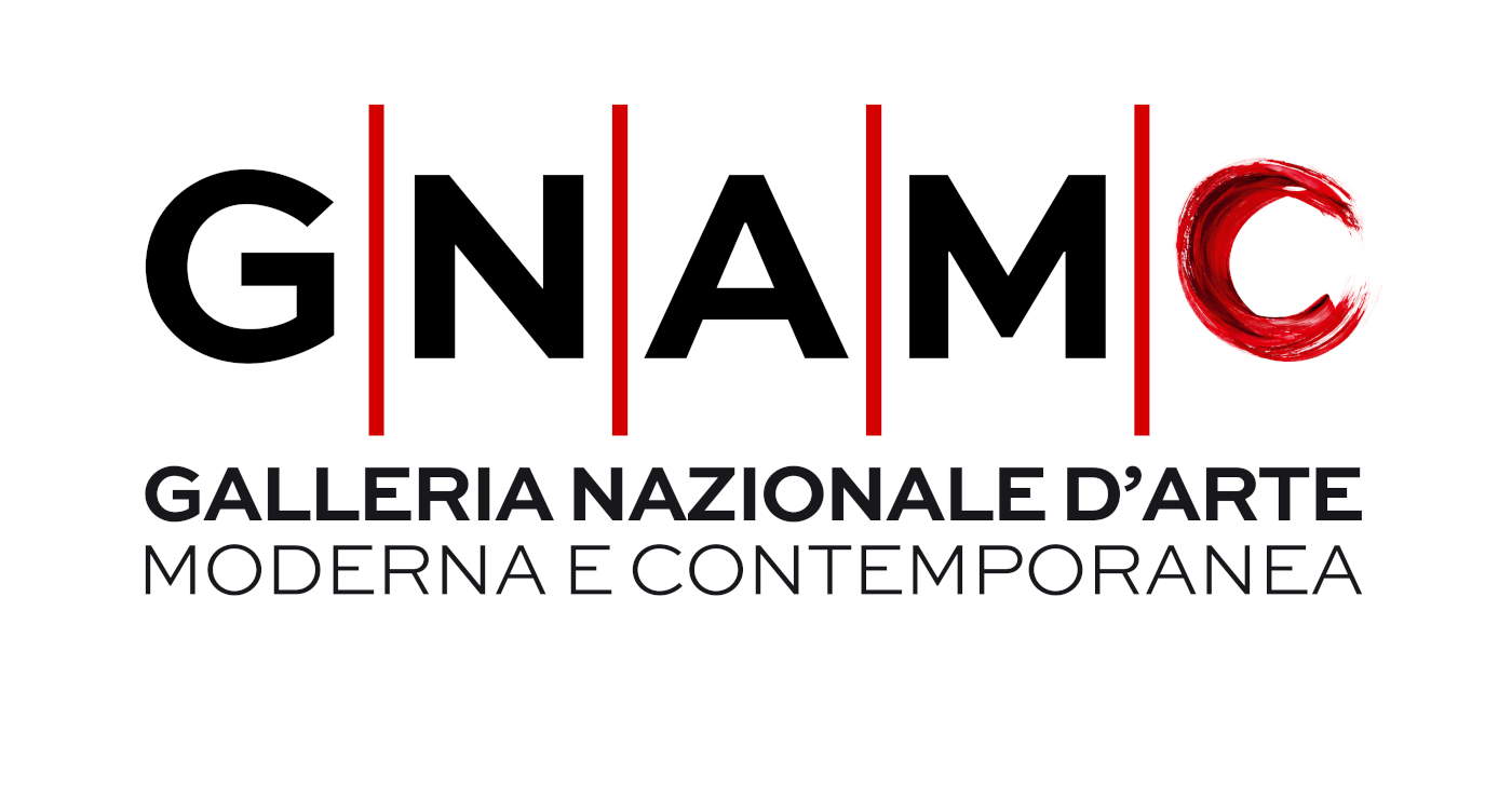
The solution adopted therefore takes the GNAM acronym and updates it, adding the letter “C” for “contemporary” to emphasize the inclusive and modern nature of the collection. The new visual identity was entrusted to the creative project of Lorenzo Marini, who developed a logotype with a typeface that intends to combine authoritativeness and contemporaneity: GNAM is represented with a basic and traditional typeface, while the “C” is painted in red and made in an artistic style, evoking dynamism and flexibility. This choice makes it possible to enhance both historical memory andopenness to a dialogue with the present.
The National Gallery of Modern Art, established in 1883 as a museum of the present, had already changed its name in 1939 to include contemporary art. The new visual identity G/N/A/M/C reaffirms this original mission, aligning tradition and innovation in a distinctive and integrated sign.
The strategy, as director Cristina Mazzantini states, “intends to evolve the historical positioning of the museum, perceived and consolidated as GNAM, toward a younger, dynamic image that is open to the international art community.” A chameleon-like logo in which the artistic “C” can constantly change its image, becoming a tactical tool to be declined with a specific graphic sign on each occasion. “Imagine the ’C’ painted by Van Gogh or by De Chirico, by Boccioni or by Warhol, to enhance the many masterpieces in the museum’s collection,” concludes Director Mazzantini. “Dynamism becomes the expressive dimension that identifies the new GNAM, which aims to forge a personalized creative relationship with visitors.”
“A contemporary logotype today cannot live only in a static, paper and two-dimensional dimension,” explains Lorenzo Marini. “According to the new evolutions of international digital communication, it must animate, modify as needed and become a variable element in the institutional framework of GNAM.”
 |
| GNAM adds a C and becomes G/N/A/M/C to unite historical memory and contemporaneity |
Warning: the translation into English of the original Italian article was created using automatic tools. We undertake to review all articles, but we do not guarantee the total absence of inaccuracies in the translation due to the program. You can find the original by clicking on the ITA button. If you find any mistake,please contact us.
