If there is one thing to praise and admire in Luca Beatrice, the curator of the exhibition Andy Warhol. Pop Society currently underway at the Palazzo Ducale in Genoa, it is his persevering and courageous tenacity. And this tenacity is embodied in his attempts to present his exhibition as original, new, unusual: this stubborn defense of originality is the basic assumption of each of her interviews or interventions on the Palazzo Ducale review, as well as the main point around which her essay in the catalog revolves, as well as the preamble with which Beatrice introduces the public to the exhibition in the ever-present audio guide (and it is worth noting that the visitor who chooses to avail himself of the tool, included in the ticket, will have the pleasure of spending the entire exhibition tour with Beatrice’s own voice guiding him through the works). “This is not just another exhibition,” he tells us. “It’s not the usual Andy Warhol exhibition,” he keeps telling us. Nice try, Luca Beatrice. Because Andy Warhol. Pop society is exactly the usual Andy Warhol exhibition. And, let’s be clear, there would be absolutely nothing wrong with putting on an exhibition as original as a ham sandwich but based on a good popularizing project, also because Andy Warhol is an artist who, although far from easy, sells himself very well even without having to resort to any particular stratagem. The important thing is to speak clearly to the public.
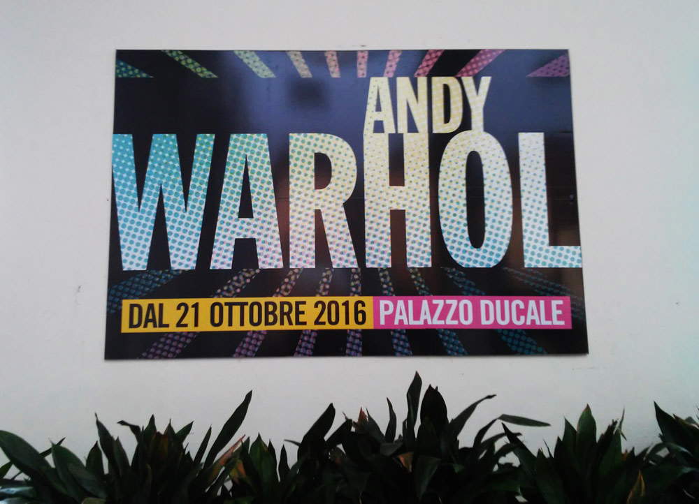 |
| Welcome to “Andy Warhol. Pop society” (all photos, except where otherwise noted, are ours). |
Not least because Andy Warhol. Pop society gets off to a very good start. The visitor, in fact, is immediately invested in the opening by the icons of Marilyn, Mao and Jacqueline Kennedy, among the most recognizable and significant of Warhol’s production, which make it clear what the fundamental concept of the U.S. artist’s aesthetic is: “an artistic representation based on two absolute principles, objectivity and repetition.” This reads the introduction to the first section of the exhibition, devoted to icons. What, however, is thatpop icon that is supposed to be the subject and thread of this first of six parts, each marked by a different visual direction? In other words, what is the process that makes the portraits, to which the second section is devoted instead, transcend and become icons? The exhibition, in this sense, is not at all clear, so much so that (just to give a couple of examples) in the portraits section there appear references to the wonderful Ladies and gentlemen series whose prints, however, at the Doge’s Palace, are promoted to the status of icons and included immediately along with Marilyn to Mao, Jacqueline and the dollar sign, while the famous portrait of Liza Minnelli, so powerful that it is compared (even in the exhibition) to Salvador Dalí’s equally powerful Surrealist divan, appears surrounded by a swarm of comprimariums that undermine the importance of the work.
If one has to give credence to the reading of Jane Daggett Dillenberger, the late Berkeley art historian, that Andy Warhol’s art is grounded in a particularly deep religious substratum (the family was of Byzantine Catholic tradition, and in all the rooms of the Warhola house - that’s the artist’s real last name, later Americanized into Warhol - were icons), the fact that, for Byzantine art, the image was an instrument of mediation between the believer and the divinity, ends up having considerable weight in the aesthetics of the great Pittsburgh artist. So much so that certain Warholian icons are attributed highly symbolic signs: the gold on Marilyn’s face (in Byzantine art, gold is a symbol of eternity), Jacqueline Kennedy’s expression immediately after the fatal assassination attempt on her husband in Nine Jackies, a work that becomes a kind of pop Passion, or the prominence given to Liza Minnelli’s lips (kissing the icon, in Byzantine rituals but also in certain demonstrations of Roman Catholic faith, think of the display of the reliquary of St. Gennaro in Naples, is a way of making contact with divinity). An exhibition designed for a large audience is certainly not asked to delve into an aspect of Warhol’s art that, moreover, is rather controversial and has begun to be investigated by critics not so long ago (kudos, however, to Carlo Freccero, who in the meritorious essay in the catalog hints at the subject), but one expects, at the very least, that there will not be the confusion that seems instead to be, at least in the first sections, the leitmotif of the exhibition.
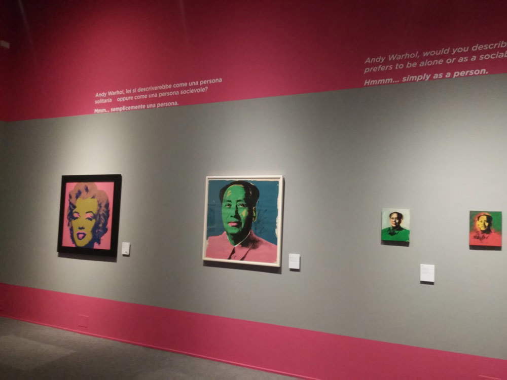 |
| The icons of Marilyn and Mao at the beginning of the exhibition. |
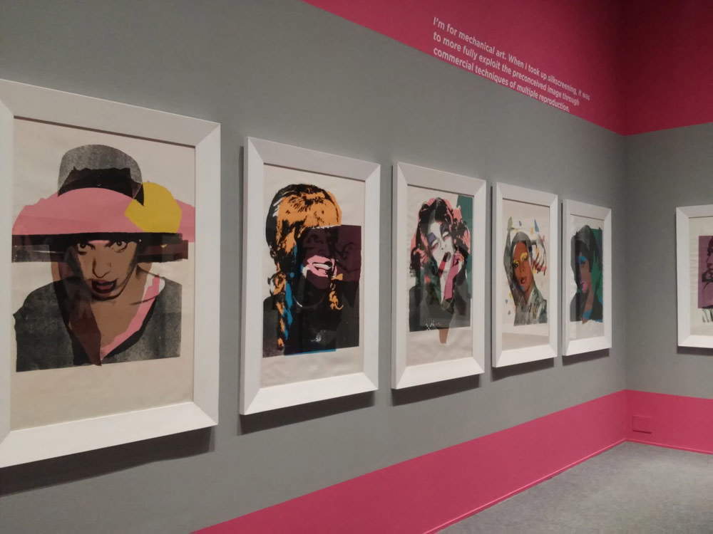 |
| The room with the “Ladies and Gentlemen” series. |
Adding to this feeling of being in a confused cauldron is also the bizarre choice to include, in the path that should be reserved for icons, Andy Warhol’s most experimental, and at the same time least known, works: one of the piss paintings, an ironic response to Pollock’s action painting, and chocolate painting. Which, moreover, in the exhibition appear together with such a celebrated icon as the Campbell soup can (they are just a few inches apart on the same wall) and in the same room where the public can observe the celebrated Brillo Boxes (the reference to Arthur Danto, philosopher and critic who more than any other has analyzed this absolutely central work in the Warholian journey and the true watershed of pre-Warhol and post-Warhol art, is entirely due, and in fact the task of quoting Danto - in the audio guide - is fulfilled, albeit rather superficially). The desire to show a little-known Andy Warhol is entirely laudable, but at the same time inconsistent with the guidelines that are provided to the public: it almost seems as if the curator felt the need to tell the visitor “you know, Warhol is not just the artist of Marilyns and peeled tins” and that, gripped by the urgency to show him something that could prove this assumption, he threw a couple of works sans façon into a space that had been casually left empty. Not least because the works deserve to be explored further, and not only as revealing connections with the first truly all-American art movement in Western art history,Abstract Expressionism, but also as interesting demonstrations of the underlyingambiguity that has characterized the entire oeuvre of Andy Warhol, a complex, paradoxical and contradictory artist. Because piss paintings (or, to use a more politically correct terminology, oxydation paintings) have been given opposing readings: for Rosalind Krauss they are works intended to dilute the violence of Pollock’s images, while for others they are simply mocking paintings, whose only purpose is to mock the works of the Abstract Expressionists.
Of the section that follows, devoted to portraits, a brief mention was made above: it is certainly the least interesting part of the entire exhibition, but there are two particularly exhilarating moments that raise the level of the exhibition and are worth writing a few words about. The first is the portrait of his mother, Julia Warhola (née Júlia Justína Zavacká), who always played a key role in Andy’s life: she followed him shortly after the artist left his native Pittsburgh to move to New York, shared with her young son the difficult early stages of his new New York life, was a constant source of inspiration for him since she used to dabble in small creative works (it seems that Andy Warhol got the inspiration to eternalize the famous soup cans from the fact that his mother liked to make little flowers out of used tin cans), and after the artist experienced success she also acted as an extra in some of his films. In essence, through the mother’s portrait we come into contact with the more private Andy Warhol and thus, perhaps, with the more impenetrable one: we are transported to a totally different dimension than that of the icons and portraits of celebrities of the time, and the choice to place the work almost in the background, in a dimly lit corner, is one of the most intelligent of the entire exhibition and certainly gives credit to a portrait that is pregnant with meaning. The second exhilarating moment, on the other hand, is of a totally opposite sign: at the end of a long corridor carpeted with other portraits, in fact, four effigies of Mick Jagger await us, to whom, lacking in the exhibition the Velvet Underground’s banana, it falls to the onerous task of explicating the fruitful relationship between Andy Warhol and music. These works are interesting not only because of their intrinsic significance and the fact that they give rise to a thousand considerations about a character who, after revolutionizing the world of music, had become a part of the international jet set, but also because at the time (we are in the mid-1970s) Andy was experimenting with a new technique, and here we can appreciate it very well: the portrait is constructed with torn pieces of paper and applied to the surface in such a way as to give the composition the appearance of a handmade collage.
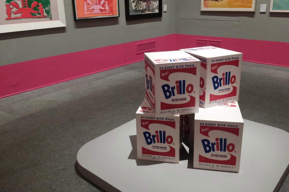 |
| The room with the Brillo Boxes |
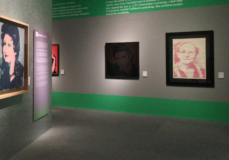 |
| The room with the mother’s portrait (the last on the right). Photo taken from the exhibition press materials. |
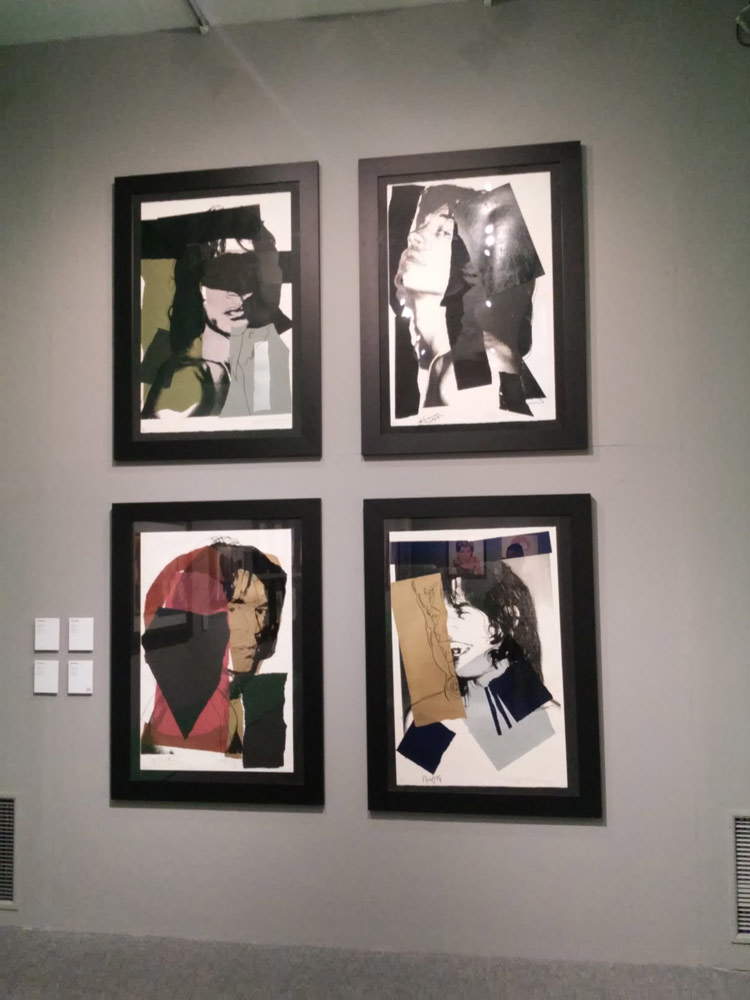 |
| The portraits of Mick Jagger |
If the third section of the exhibition, devoted to advertising, runs a bit smoothly (it is the dullest and certainly the most incomplete of an exhibition that, after all, is entertaining and glides along nicely), Andy Warhol’s true masterpiece. Pop society, as well as one of the main reasons to enter the Doge’s Palace, can be considered the room dedicated to drawings. The visitor, here, will find unexpected gems that can provide a well-rounded portrait of Andy Warhol, perhaps even more than the entire exhibition put together succeeds. There are some jewelry studies drawn in the 1950s, when Andy was a young illustrator for fashion magazines struggling to build a career. There is one of the drawings that traces the photographs of Wilhelm von Gloeden, a German artist who attracted quite a bit of heat for his images of male nudity (and of course the fact that Andy had some interest in von Gloeden’s photographs was but one of the reasons that fueled speculation about his sexuality). There are self-portraits, there are drawings of animals (including one of a cat, and it is worth pointing out that Andy Warhol had a soft spot for the little domestic feline: in their New York apartment, he and his mother kept a dozen cats, all named Sam-imagine the confusion when they had to name one), there are preparatory drawings for an icon like the Dollar Sign, and there are also, in a couple of display cases, picture books, including ones for children. A definitely little-known Andy Warhol worth delving into. It’s just too bad that, in the exhibition, the drawings have been placed on two registers, with the top one more than two meters high, making it uncomfortable to read.
On the fifth section, dedicated to the relationship between Andy Warhol and Italy, there is a separate discourse to be made, since it is one of the two poles around which the entire exhibition revolves, by the curator’s own declaration at the opening of the itinerary. The other, incidentally, is Andy Warhol’s influence on our present. Which means everything and nothing, because depending on how one reads the intention to explicate the artist’s role for us living in the twenty-first century, it could be said that the goal has been hit, and at the same time that it has been missed: if one guesses easily enough how Andy Warhol has succeeded in making art (I quote from Luca Beatrice’s catalog essay) “a popular language,” that “there is no need to protect it in an ivory tower,” and that an image, “to pierce the general indifference and apathy to which we have been addicted since the imposition of the media society in the 1960s , can be repeated an infinite number of times,” it becomes more difficult, on the other hand, to understand Andy Warhol’s “palpable influence in our present and far from exhausted” on film, fashion, television, music, and publishing. The exhibition, in other words, has a few too many difficulties in comprehensively answering some questions such as “why and how Andy Warhol has had and continues to have such a vast influence on our present,” or “why contemporary art as we understand it begins with Andy Warhol” (to reiterate: Arthur Danto, in the exhibition, is only mentioned in a rather hasty way). Returning instead to the relationship between Andy Warhol and Italy, the idea of immediately opening the section with references to antiquity in Warhol’s production is interesting (Leonardo’s Last Supper and Piero della Francesca’s St. Apollonia refer back to the centuries-old tradition that wants Italy and the study of Italian art to be an obligatory passage for artists of all latitudes), but the discourse soon becomes jumbled and inconclusive as we move, in close and rapid succession, to portraits of Armani and Amelio, images of Vesuvius, and newspaper clippings. The curiosity to know that Andy Warhol returned to Italy on several occasions and had something to do with our country is completely satisfied, but it does not go much further.
Totally useless instead is the last section, devoted to polaroids: it is true that by now there is no exhibition on Andy Warhol without a slew of polaroids being offered (little does it matter if there is then a lack of organicity and the pouring of photographs is not very coherent with the path of the exhibition: it’s enough for the visitor to know that Andy Warhol had a mania for constantly pressing the button on his camera), but if the section is forced into the context of the exhibition, and if, moreover, in order to kick the section on polaroids into the exhibition, violence has to be used to a setting such as the Doge’s Chapel, it’s already so much if expletives don’t fly. Indeed, the sumptuous and intact frescoes by Giovanni Battista Carlone have been rendered totally illegible by a steel banger that covers the room almost entirely: and if in Bologna the contraption with which Goldin had practically obscured, in Palazzo Fava, the Carracci frescoes in order to show the Girl with a Pearl Earring, had earned almost unanimous indignation, what should be said of this heavyweight uppercut dealt to one of the major fresco painters who worked in Genoa in the seventeenth century? Thus, if one had come out of the previous section intending to give the exhibition an all-sufficient grade, this latest surprise, unnecessary and unpleasant (even in light of the fact that the most recent museographic debates are about how to respect historical environments, especially when decorated, and not about the most creative ways to take them skidding), makes one lean toward rejection.
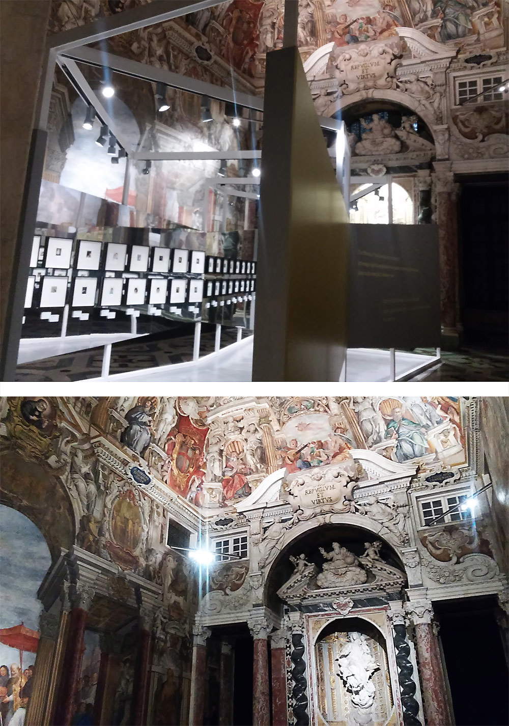 |
| The Doge’s Chapel: top with the polaroid banger, bottom empty (the second photo was taken during last year’s From the Impressionists to Picasso exhibition: the curators then left the Chapel vacant) |
Before concluding, a necessary note about the catalog. There are three essays, and two of them have been mentioned above: Luca Beatrice’s is anhonest introduction that tells us in broad strokes about the figure of Andy Warhol. Carlo Freccero’s, the most interesting of the lot, focuses instead on the role of theimage within the Warholian philosophy. Maurizio Ferraris’, on the other hand, we would have very gladly done without. And not only because of its title(Warhol and the Great Beauty, a flash of originality) and the fact that it is a rather rambling contribution, but also because it contains a rather nonchalant interpretation of a fundamental text such as Arthur Danto’s The Transfiguration of the Trivial, to whom is attributed the alleged “error” (Ferraris’ term) of having considered the Brillo Box as a ready-made. Obviously Danto was no slouch, obviously the U.S. philosopher was well aware of the differences between Warhol’s and Duchamp’s works, and obviously in The Transfiguration of the Tri vial there is no trace of this error, on the contrary: to the Brillo Box, Danto refers with terms such as artifact and facsimile that already include the negation of the very concept of ready-made. It is less obvious to understand why Ferraris launched into such reckless exegesis of Danto’s essay.
Andy Warhol. Pop society leaves, in essence, a bit of a disappointment, if we take into account the high expectations mentioned at the beginning, those that the curator instills in the hearts of visitors who imagine to find themselves immersed in an exhibition they have never seen before, and who will instead have to content themselves with an operation not too dissimilar to those seen in past years in Pisa, Milan, and Rome. One can always console oneself with the drawings. And of course, for those who have developed a great passion for Andy Warhol, the idea of seeing several of the American artist’s major works on display is nonetheless a lure that cannot be resisted. For fans, it is worth a visit, without a shadow of a doubt. Then, the exhibition is good enough for those who are not at all familiar with Andy Warhol’s art and wish to receive a broad smattering, with some very interesting insights here and there, but always keeping in mind that even from the popularization point of view the itinerary is rather confusing. And in any case, to bear the title of “an exhibition different from the others,” there is still a decidedly long way to go.
The author of this article: Federico Giannini
Nato a Massa nel 1986, si è laureato nel 2010 in Informatica Umanistica all’Università di Pisa. Nel 2009 ha iniziato a lavorare nel settore della comunicazione su web, con particolare riferimento alla comunicazione per i beni culturali. Nel 2017 ha fondato con Ilaria Baratta la rivista Finestre sull’Arte. Dalla fondazione è direttore responsabile della rivista. Nel 2025 ha scritto il libro Vero, Falso, Fake. Credenze, errori e falsità nel mondo dell'arte (Giunti editore). Collabora e ha collaborato con diverse riviste, tra cui Art e Dossier e Left, e per la televisione è stato autore del documentario Le mani dell’arte (Rai 5) ed è stato tra i presentatori del programma Dorian – L’arte non invecchia (Rai 5). Al suo attivo anche docenze in materia di giornalismo culturale all'Università di Genova e all'Ordine dei Giornalisti, inoltre partecipa regolarmente come relatore e moderatore su temi di arte e cultura a numerosi convegni (tra gli altri: Lu.Bec. Lucca Beni Culturali, Ro.Me Exhibition, Con-Vivere Festival, TTG Travel Experience).
Warning: the translation into English of the original Italian article was created using automatic tools. We undertake to review all articles, but we do not guarantee the total absence of inaccuracies in the translation due to the program. You can find the original by clicking on the ITA button. If you find any mistake,please contact us.